Our Approach to Responsive Web Design
For Markit On Demand, responsive web design is more than a methodology. It is part of a larger mobile strategy and a philosophy we believe in enabling us to create rich, personalized user experiences on any device.
In its simplest form, responsive web design (RWD) is a methodology for building modern web applications so they adapt to different screen sizes. The proliferation of mobile devices, increased wireless speeds and advancements in web-based capabilities has accelerated firms’ desires to take advantage of this rapidly expanding opportunity. In today’s financial services world, this much is clear: having a mobile-optimized or responsive website isn’t enough, firms need a mobile strategy.
Responsive design for finance is different
We’ve all seen the Boston Globe’s groundbreaking responsive website. The Guardian has their new responsive site in beta (and open sourced it). Microsoft.com has been responsive since 2012 and Apple’s latest redesign is, too. Those sites all demonstrate RWD in their own way yet they’re all media or product marketing sites. Examples of responsive financial websites are hard to find and therein lays the problem. Financial information is complex, it’s highly regulated and it’s often tabular. Responsive design for finance is different. We know this; Markit On Demand has been designing financial websites for more than 20 years.
There’s no “M” in “RWD”. It’s important to note that responsive web design isn’t limited to mobile devices despite the associated “mobile first” approach to building modern websites. The RWD methodology is device agnostic: you could shrink down a site for a 320-pixel screen and simultaneously use it to enhance a user experience on ultra-wide HDTVs.
How does RWD work?
It’s (almost) all in the CSS. CSS is where a site’s presentation—colors, fonts, and layout—is declared. CSS has special declarations called Media Queries and it’s within those where developers can define rules for any part of a site’s presentation. The Media Query declaration translates to a query of the device’s screen size or viewport. Simplistically, developers can create rules such as the following:
- By default, set the article headline font size to 15 pixels.
- If the device’s viewport is at least 768 pixels, set the article headline to 20 pixels and bold.
In CSS, this looks like:
Of course, this basic example could easily be extended to cover more complex use cases and CSS is just one option to accomplish RWD. Technologies like Responsive Design + Server Side (RESS) aren’t new and are gaining popularity.
While we’ve written plenty of code to handle various scenarios, we feel there are benefits in taking advantage of code written by the open source community. We prefer the HTML & CSS framework Bootstrap, and have perfected the way to customize it for some client projects. In everyday development, using Bootstrap allows our 120+ front-end developers to stand up custom, responsive, mobile first and standard grids. How can it be custom and standard at the same time? Simple: we use LESS for customization and rely on the well-documented HTML structure in Bootstrap for standardization. This means our developers are spending more time on custom solutions and less on simple column collapsing responsive grids.
It’s fluid. No, it’s adaptive. It’s definitely responsive. Wait, what?
Our interpretation and understanding of responsive web design is straightforward. We turn to TreeHouse for better descriptions than we could’ve written ourselves (they have a nice video, too):
Fixed
Fixed websites have a set width and resizing the browser or viewing it on different devices won’t affect on the way the website looks.
Fluid
Fluid websites are built using percentages for widths. As a result, columns are relative to one another and the browser allowing it to scale up and down fluidly.
Adaptive
Adaptive websites introduce media queries to target specific device sizes, like smaller monitors, tablets, and mobile.
Responsive
Responsive websites are built on a fluid grid and use media queries to control the design and its content as it scales down or up with the browser or device.
Mobile strategy
Responsive web design is just one possibility for firms searching for a mobile strategy.
In today’s world of mobile consumption and social networks, dedicated “m dot” (m.) mobile sites are playing a crucial role in product marketing and access. Much of this has to do with performance. Some of it’s for search engine optimization. In other cases, firms really need a unique and dedicated mobile site.
So, what’s the difference between an m. site and responsive site?
“M dot” mobile websites are dedicated solutions most commonly created for access on a smartphone. They are usually fixed-width, have no responsive layout, and are designed specifically for tap interactions.
Responsive websites are designed so that any single HTML page can be viewed on any device and it “responds”. This means the same exact content, assets (like images and javascript files) and experience is downloaded to each device. CSS then adjusts the presentation of that content. (This is one of the major negatives of responsive web design—often only a fraction of the resources needed for the desktop view are needed on the mobile view yet they’re all downloaded regardless.)
The short answer on whether or not you need a m. mobile website heavily depends on your product, how your users engage with your content, and how much you’re able to commit to managing yet another website.

Standard Bank of South Africa
Standard Bank partnered with Markit On Demand to create its Research Portal featuring desktop site, a mobile website and host of native apps (iPhone, iPad and BlackBerry).
It’s important to understand the difference between m. and responsive sites, and the relationship between them. Smashing Magazine ran an article last month discussing just that.
Designers and developers have been oversimplifying the problem of mobile since 2000, and some people now think that responsive web design is the answer to all of our problems.
We need to understand that, beyond any other goal, a mobile web experience must be lightning fast. Delivering a fast, usable and compatible experience to all mobile devices has always been a challenge, and it’s no different when you are implementing a responsive technique. Embracing performance from the beginning is easier.
Responsive web design is great, but it’s not a silver bullet. If it’s your only weapon for mobile, then a performance problem might be hindering your conversion rate. Around 11% of the websites are responsive, and the number is growing every month, so now is the time to talk about this.
According to Guy Podjarny’s research, 72% of responsive websites deliver the same number of bytes regardless of screen size, even on slow mobile network connections. Not all users will wait for your website to load.
There is a lot of emphasis being put on the optimization of online experiences for mobile in 2014. At O’Reilly’s FluentJS conference earlier this year, Paul Irish recommended delivering content users can see in less than a second and under 14kb. At the same conference Lara (Swanson) Hogan, responsible for performance at Etsy, said “Web performance is user experience”. The point is developing a mobile strategy is multi-faceted: target audience, purpose, content choices, and performance must all be considered.
There’s more to responsive than meets the eye
So, you have a responsive website. But wait, does that scaled-down carousel support swipe events for tablet or phone users? There’s a lot more to responsive design than rearranging the page layout so it fits within the viewport. User interactions need to be considered for every page. Swipe events need to be added for horizontal scrolling, mouse pointer click targets need to be enlarged for fingertips (Apple recommends 44x44) or multi-touch, and forms laden with input fields need to be reconsidered.
If user experience is an important design factor on desktop sites, it’s magnified on mobile devices.
Content degradation strategies
This leads us to content degradation strategies. What’s that you ask? It’s a strategy for reducing the amount of content displayed as the device gets smaller. In general, people are using mobile devices in limited ways. Phones are always-on and for Tweet-sized short bursts of information, real-time notifications, and quick actions (buy a stock, check in for a flight, buy from Amazon, etc). Tablets are for a couple of uses: as a second screen during the day, as research tool at night on the couch or as a primary computer (replacing the laptop).
This much is clear: users are definitively not looking for the exact same ‘desktop’ experience on their mobile devices. In scenarios where firms have deployed feature-for-feature copies of desktop solutions on mobile, they’re discovering their users just aren’t utilizing those features. That constitutes a considerable amount of wasted effort, so we encourage creating a strategy for determining which content sets, tools and features will be offered on mobile devices. In every case, phone and tablet experiences should be a subset of the desktop equivalent.
Let’s look at some examples:
Stock screeners
Phones aren’t used for in-depth research, so don’t build a stock screener with a dozen-plus input criteria. Alternatively provide predefined screens or trading ideas. On tablets, employ the same strategy and show more data on the results view.
Equity research
No one is reading 10-page PDF research documents on their phone. If they are, they’re struggling. Alternatively, provide an abstract (140-characters or less) with an option to read it later (the “briefcase” feature). Possibly integrate with services like Readability or Pocket. On tablets, implement the full feature set and allow users to filter and view research on a device tailored for exploration and reading.
Interactive charts
Similarly to stock screeners, full-featured interactive charting on a phone isn’t a worthwhile investment for product owners. Users want easy-to-read 5 day charts with enough detail on today’s activity. On tablets, reveal more features—not all of them—and allow users to engage in a potentially playful research experience on the couch or offer power users a streaming second screen. Our new interactive charting solutions for iOS and the browser cater for these use cases.
Streaming market data
Don’t stream on mobile devices. Over-the-air (HTTP) connections to web services are the most expensive operations on phones and can quickly burn down a user’s battery. If you must stream, implement it carefully with polling on an interval versus a persistent connection, perhaps offering users a throttle control.
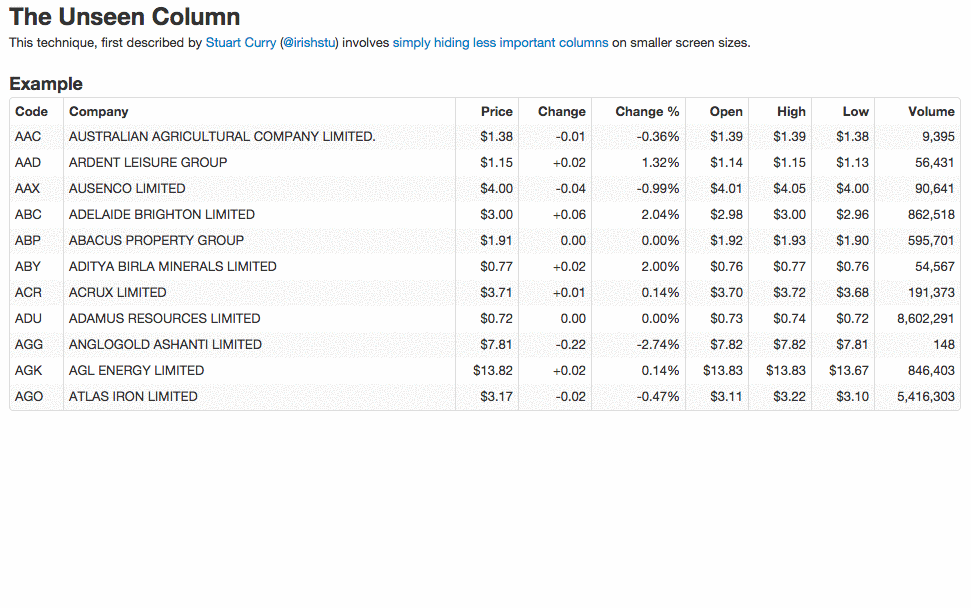
Wide-column tabular data
For wide tables of financial data, use RWD techniques to collapse columns deemed non-critical for consumption on a phone. Take this great “unseen column” example by Simon Elvery as one option:
Expectations from mobile
In a recent Fast Company article, Dan Gardner and Mike Treff wrote:
“Today, users expect online experiences that not only respond to what device they’re using, but also their location, time of day, what they’ve already read, and events happening in real time.”
Having a mobile strategy and using RWD only apply to one part of that statement: “what device they’re using”. Location, time of day, content history, and notifications are all features users are expecting from mobile websites and apps. Markit On Demand’s content personalization and notification distribution capabilities have been designed with these expectations.
Responsive email
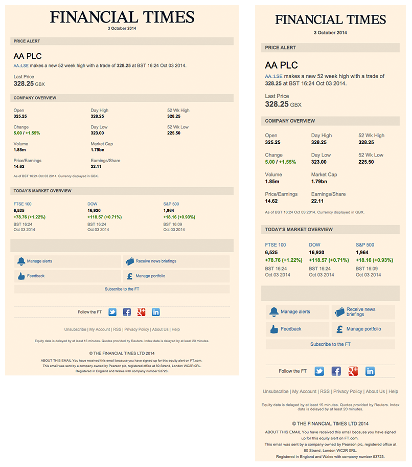
Last but not least, the often neglected topic of email when discussing RWD. Modern email clients—Outlook, Gmail, Yahoo! Mail, etc—are all capable of rendering responsive email templates. A marketing study released earlier this year reported 65% of (marketing) emails were opened on mobile devices.
We recently partnered with the Financial Times to design, develop and deliver market data responsive email alerts. Here is a screenshot of one such notification below. Financial Times readers now enjoy a better experience reading price alert emails because of RWD.
Going forward
Creating a mobile strategy by looking broadly at product, users and goals is a good first step in going forward. It begins and ends with the product team, and while engineers and developers implement the solution, the entire team has to be responsible for crafting the user experience. We’re happy to help you navigate this often challenging landscape and build on our previous experiences in developing for mobile.