The Current and Future State of Charting
###Where Are We Now?
Markit on Demand set the bar in web-based financial charting over a decade ago. Using a combination of precision design, our handcrafted charting technology, Ajax, and carefully implemented javascript UI, we were able to eliminate the reliance on Java applets and Flash files for customized equity charts.
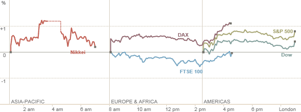
We have refined the underlying technology to minimize our implementation time, even while making the charts more customizable. We have also refined the tiny details that go into making a chart beautiful, down to the last axis tick and Nikkei lunch break. This charting platform has been primarily image-based, with accompanying meta data to drive interactivity.
Today, investors expect even more from their charts – both in their browser, as well as on their tablets and phones. They demand a high level of interactivity, including ‘pinch and zoom’, drawing trendlines and Fibonacci retracements, and the ability to share a chart with others. They expect streaming on the chart, intuitive transitions, as well as every possible indicator known to Technical Analysis.
In the past, browser incompatibilities and performance issues made true browser-based charting very difficult. As browser makers have continued to implement web standards, and machine and tablet performance continues to follow Moore’s Law, achieving investor’s expectations on charting is very achievable. Translation libraries such as Jquery and D3 allow for browser differences (especially around vector rendering, which remains inconsistent) to be abstracted away, freeing developers to focus on the charts, rather than the browsers.
Broadly, MOD sees charting trending on three paths: Charting Tools or Systems, Quick Data Visualizations, and Chart Creation Tools for journalism and editorial teams.
- Charting Tools are the interactive charts and platforms we deploy on our sites for investors to use – these are about building a flexible set of tools that can run in production with a wide variety of datasets and conditions.
- Data Visualizations are more of the infographic or point in time narrative/study variety; at times, they can function with dynamic datasets over time, but we are not always seeing this as a necessity. These are often solved using D3, and using non-traditional visualization techniques, for non-traditional datasets.
- Chart Creation Tools are generally simple tools with a finite number of configurable parameters, such as width and height, chart type, and colors, delivered in a consistent look and feel. The output format of these might vary from PNG/JPG to EPS, depending on the final use. These are typically used by a journalist, publisher, or analyst to create graphics as needed inside of a publishing workflow, on a tight timeframe, in a look and feel consistent with their overall organization. Data sources for these can include both dynamic datasets, as well as bespoke, manually entered datasets. Recently, a tool known as Quartz Chart Builder was open-sourced. It works in a very similar fashion as MOD’s Chart Creation Tools, though it lacks some of the flexibility we often include. It was written specifically to solve the problem of tight publishing timeframes, yet consistent look and feel and flexibility.
###What Are We Doing About It?
MOD/L has assembled an elite team of charting experts to build upon our charting capabilities, and allow our charts to do all of the above, and more. Each member of this team has reviewed and worked with various charting packages, frameworks and technologies over the years, including HighCharts, D3, WebGL, Three.js, Shinobi and many others. We are using the best parts of our own technologies, partnering and learning from others in this space, and combining all of it again set the bar on interactive financial charting.
The overall approach is to go imageless: use the charting metadata, data model, and overall intelligence – but not the raster image. Hand the rendering over to the client, be it browser or native device, and handle the rendering where it can be better manipulated, and interacted with.
Some of this effort has already resulted in LiveCharts, a new capability for iOS charting, allowing for "pinch and zoom" and smooth, native interactions. Created as an SDK, it allows an iOS developer to add an interactive chart of nearly any size to an existing iPad or iPhone application. It also brings classic upper and lower indicators, customizable themes and UI, and can be added with only a few lines of code.
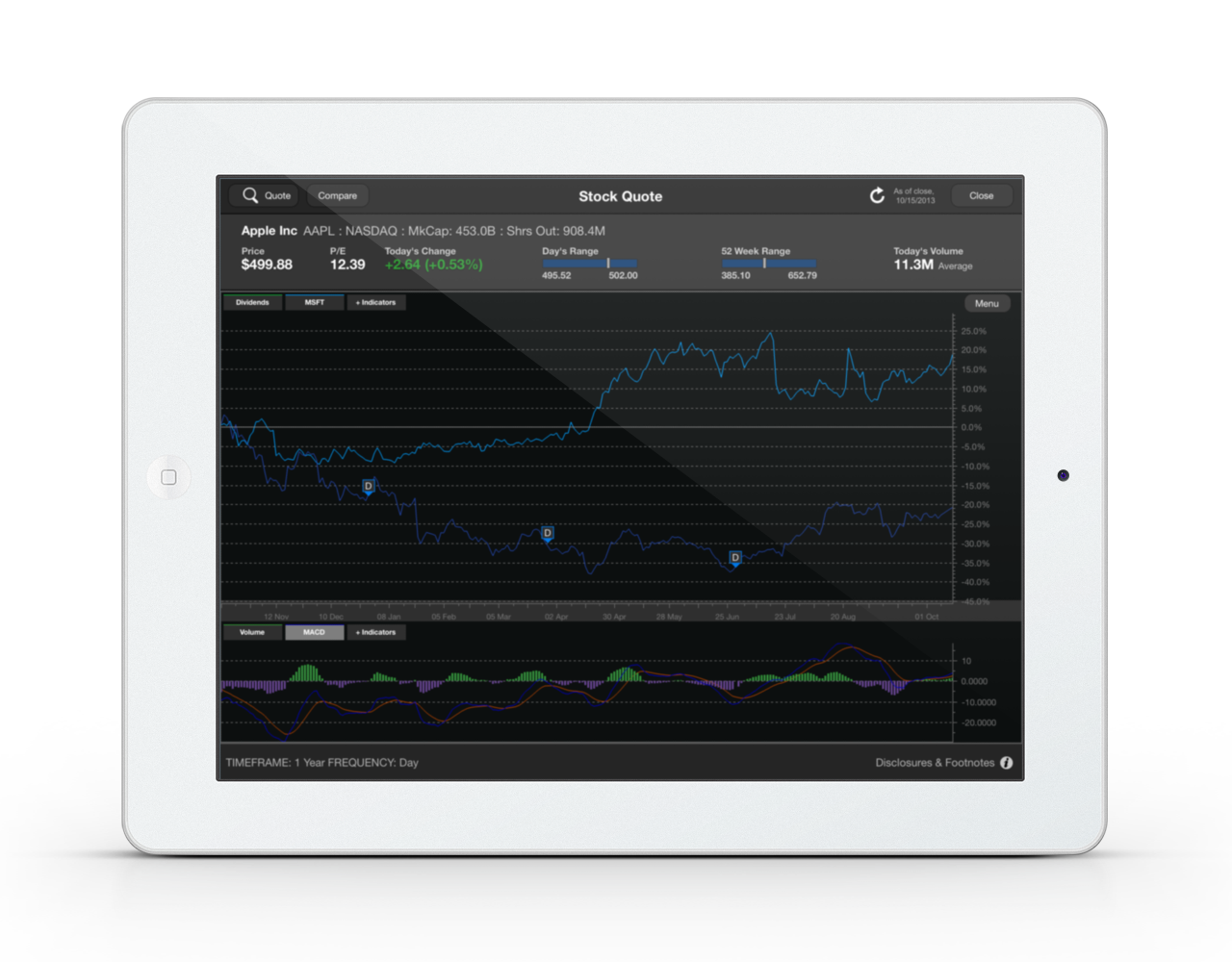
Above: Our demo app using the LiveCharts iOS SDK
The team is also currently in the αlpha stage of a Jetpack project to push the boundaries of browser-based charting. The Jetpack project is focused on Charting Tools, and raising the ante on MOD’s capabilities in that space. However, the technology and technical skills used to accompish this will be applicable to the other charting areas we are working in.
In the Data Visualization space, our team continues to work to derive relationships and insight from datasets. As part of this we are creating tools that help investors explore datasets in new visual ways and we are also looking at narrative-based explorations to use data to tell stories.
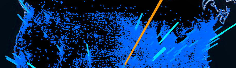
Other next-gen areas we are exploring include 3D Charting : topographic plots of data, histogram geographic displays on 3D globes using WebGL; Financial Data as Art : for example, massive renderings of large datasets in print form; and network visualizations across trading relationships.